


'Where the Light Dances' exhibition - May 2019
Working Together: The Story So Far
Karen Birchwood and Kate Schuricht met whilst exhibiting as members of the Rye Society of Artists. Here, they discovered their mutual love of seascapes and rural landscapes and a deep appreciation for each other’s work.
Capturing these landscape scenes on both canvas and in clay, both artists respond to a strong sense of place and the idea of a moment caught in time.
Before long, Karen and Kate owned pieces of each other’s art and found that the work sat beautifully together in their respective homes. This led to the idea of exhibiting together at the 2016 Open Studios in Karen’s house and then on to a group show at a local gallery in 2017. The collaboration was so successful that when the opportunity came up to exhibit together at Padstow Gallery, they seized the opportunity.
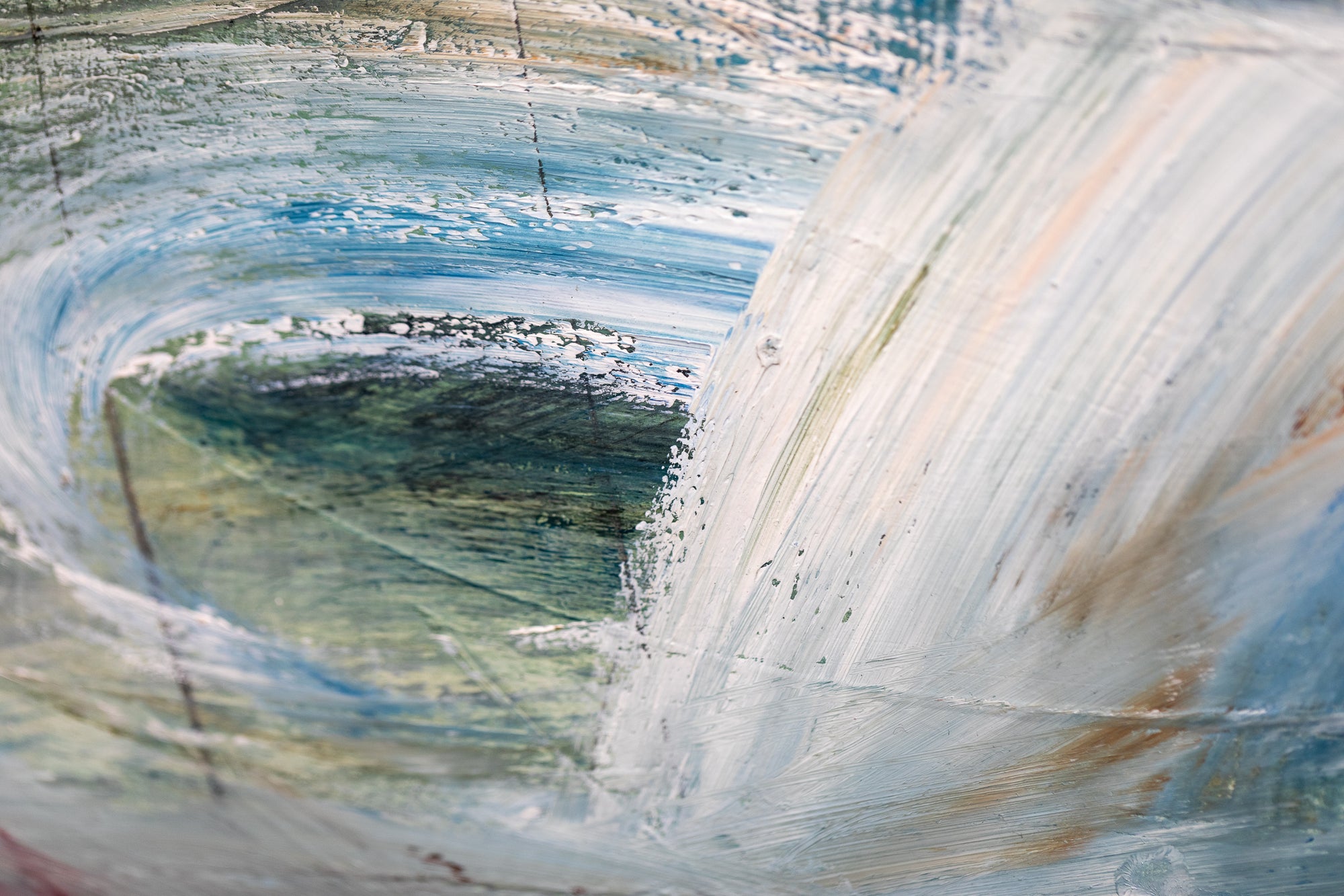
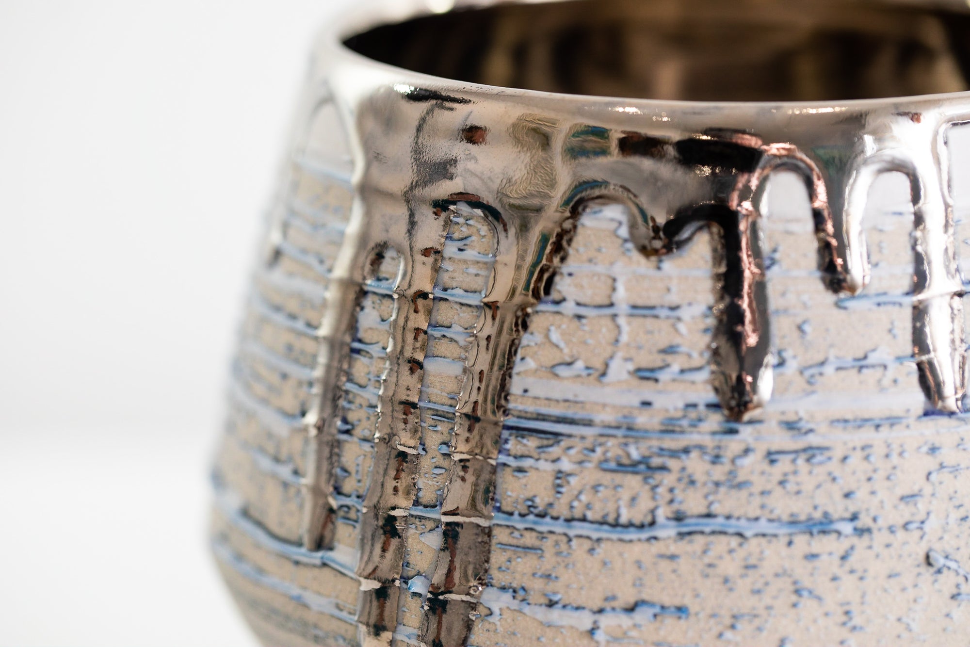
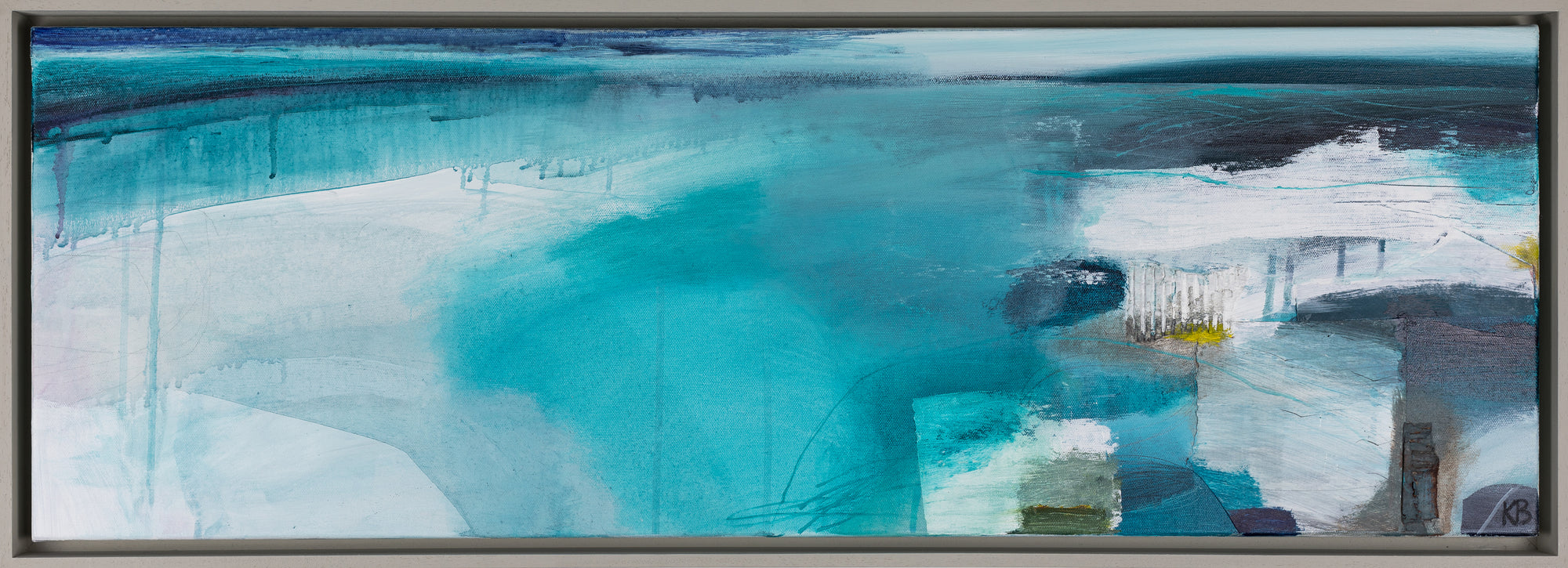
Karen is well known for her expressive use of colour and mark making that captures the movement of the sea, grass and trees in brush strokes that glide across the canvas. The stillness and calm of Kate’s elegant raku and stoneware ceramics balance well with the inherent movement of Karen’s paintings. Elements of sweeping landscapes and atmospheric seascapes are in turn delineated over the surface of Kate’s pots in layers of glaze that evoke the horizon.


Interview with Karen Birchwood, painter
Do you have a connection with a certain colour or combinations of colours?
I am always drawn to blues; in particular I have a love of turquoise. I also love to contrast with colour, for instances, a deep sweep of indigo with a flash of magenta, orange or acid yellow. I enjoy using the dirty brush water to paint with. It’s often a bit of a surprise as to which tone of colour will appear, maybe an earthy yellow or blue? Somehow, this can balance against the intense colours in a piece of work.
What inspires you to paint particular landscape scenes?
It’s quite difficult to pin down what particular one thing inspires me. It might be a group of trees I spot on the horizon, a colour of a field I pass or crops creating patterns in the land. It’s the strong connection to a place that gets under my skin. The coastline of Cornwall..... I can almost taste the air and visualize the sea, boats floating in a harbour. Holding that image in my head somehow translates onto the canvas. I often start a piece of work without much idea of what it will be. Suddenly from a sweep of colour, that memory starts to unfold in the painting.
What qualities do you most like about Kate’s ceramics?
So many qualities! I love the organic but somehow controlled shapes of Kate's pieces. Her use of colour that is subtle and restrained but somehow creates intensity, for instance an interior colour of a vessel in deep turquoise. Her raku pots with markings that make you think of the land. I am really taken with one of Kate’s vessels at the moment. It has a curved line running from the top of the vessel to the bottom. It makes me think of a ploughed line in a field or the curve of the coastline. I might have to buy it!


Interview with Kate Schuricht, ceramicist
What urges you to create?
I can be inspired to make a piece by a colour I see on a walk, a close up texture or a dramatic scene, as well as by deeper, more subconscious things. New seasons always bring on a burst of creativity, especially spring and autumn with their dramatic colour changes. When I have been away from the studio for a couple of days, I can’t wait to get back in there to start making, it’s a form of instant relaxation for me.
What inspires your designs?
I am really interested in the power of objects in conveying emotions and telling stories. My work is partly inspired by historical and contemporary boxes and containers and also by the processes involved in making. Each making process can inspire a new approach and even accidents and mistakes can have fantastic outcomes. My visits to Japan in 1995 and 1996 drew together many of my ideas and this still informs my work today.
How do you see your work connecting with Karen’s paintings?
I think we both have an intuitive way of embracing the subject of our work and an equal obsession with the colour turquoise! Although Karen’s approach to her paintings is expansive and loose, there’s a real precision there that I relate to in the positioning of my pots. The placement of objects is of key significance to me and the composition of her paintings has that same sense of perfect balance.
